
New Beginnings
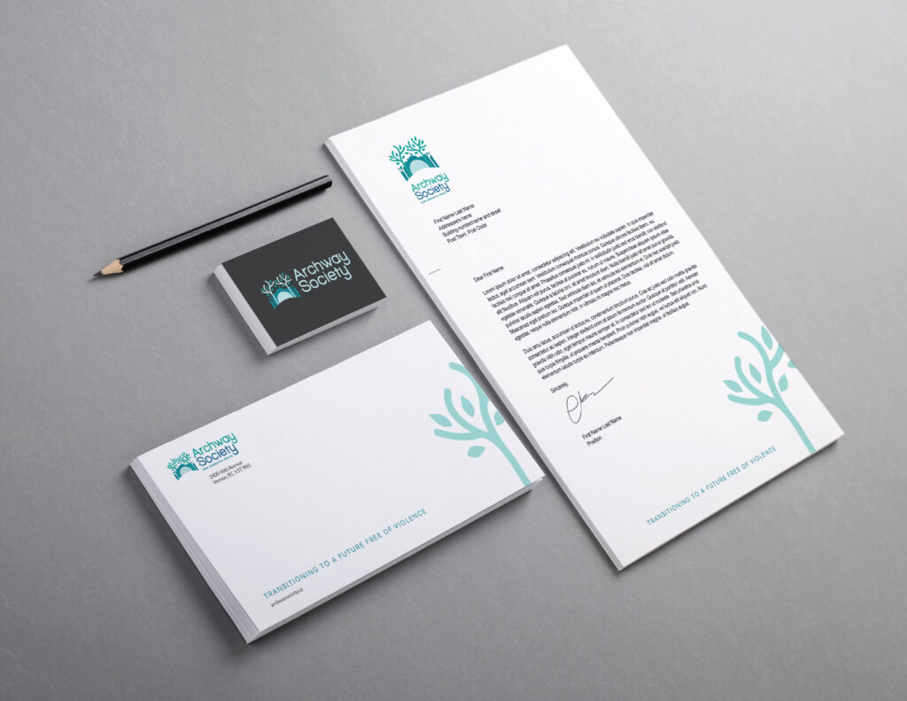
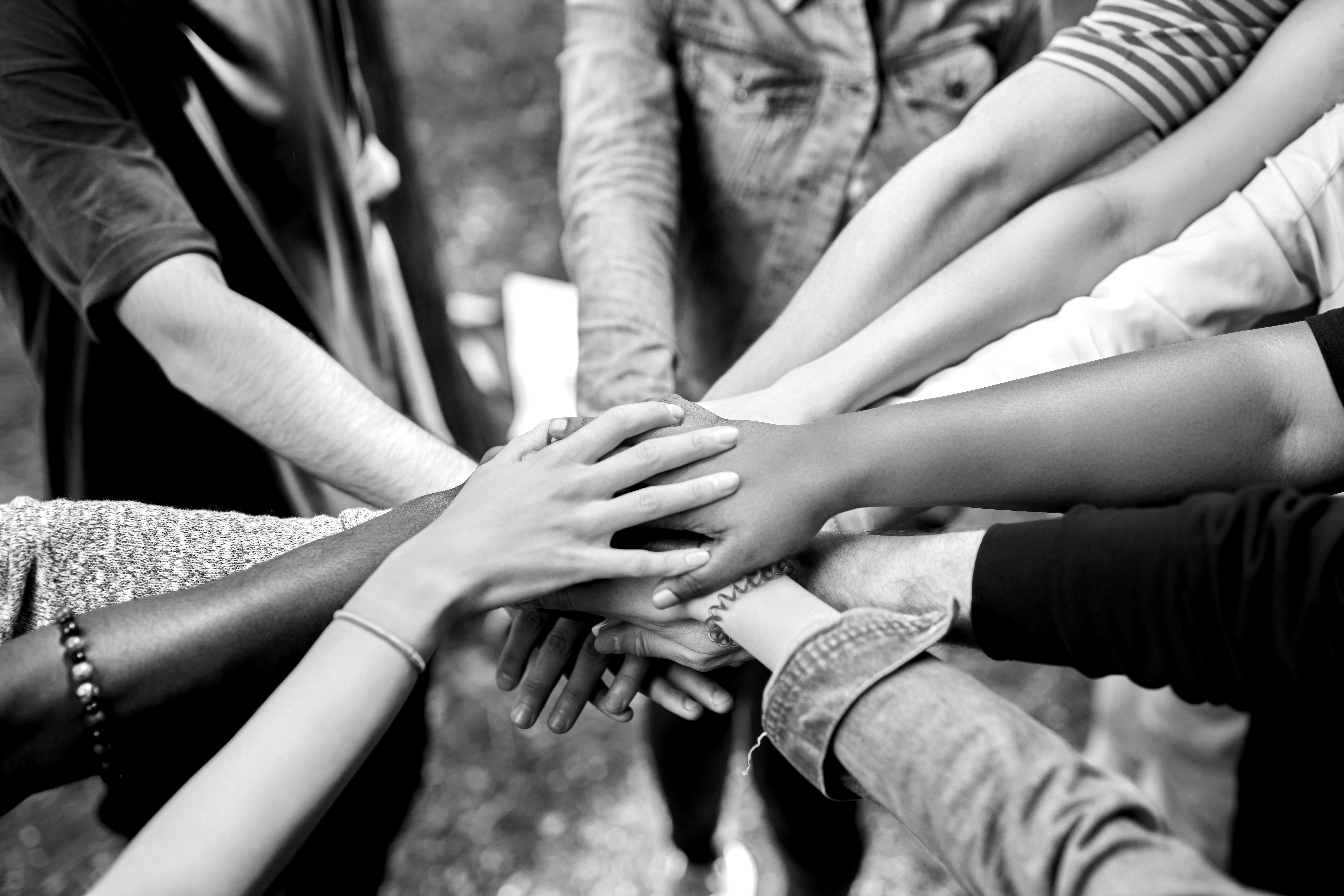
Archway Society for Domestic Peace offers a comprehensive range of supportive services for survivors of domestic and sexual violence, including safe shelter, counselling, child and youth advocacy, outreach services, and collaborative community projects.
Originally known as the Vernon Women’s Transition Society, the organization had grown and evolved significantly over the years. However, it became apparent that there was a lack of community awareness regarding the full scope of services provided, leading to missed funding opportunities. Consequently, the Board of Directors sought our expertise to rename the organization and develop a brand strategy that would effectively communicate their mission and services to the community.
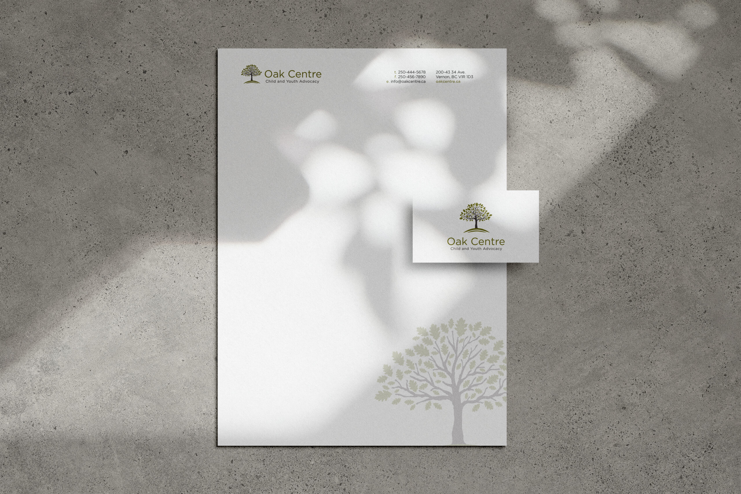
In addition to rebranding the main organization, we were also tasked with creating a new brand for one of its programs, the Oak Child & Youth Advocacy Centre (The Oak Centre). Although this program fell under the Archway Society for Domestic Peace, it required a distinct and separate brand identity.
The scope of our work with the Archway Society included:
- Renaming strategy
- Brand strategy
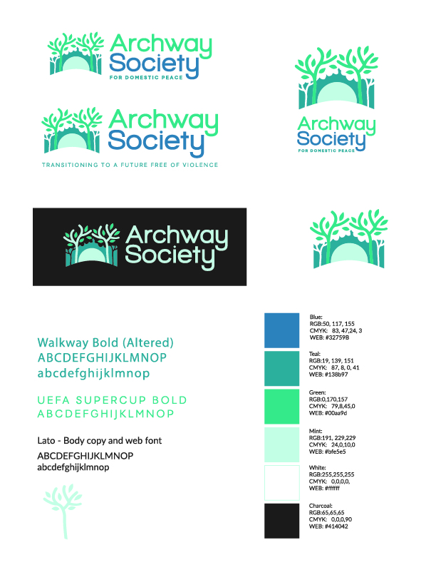
- Logo design and colour palette
- Collateral design of marketing tools
- Brand standards guidelines
- Brand strategy for The Oak Centre
- Logo design and colour palette for The Oak Centre
- Collateral design for The Oak Centre
Details about this project
Challenge
In the process of renaming Vernon Women’s Transition Society, we prioritized maintaining existing brand equity while crafting a new name and identity that aligns with the organization’s vision. It was crucial to garner support from stakeholders familiar with the old brand and effectively communicate the reasons for the rebrand to prevent confusion and ensure acceptance within the target audience and community.
The Oak Child & Youth Advocacy Centre faced distinct challenges due to the sensitive nature of its subject matter. Developing a unique brand for the program involved incorporating specific elements and messaging identified through our strategic planning.
Solution
We began by delineating the brand identity, encompassing the organization’s core mission, vision, long-term objectives, target market preferences, behaviors, and unique selling proposition. Engaging in facilitated brainstorming sessions, we actively involved key stakeholders to generate diverse ideas, employed mind mapping to explore various themes, leveraged creativity tools and, overall, prioritized simplicity for ease of pronunciation and recall.
Final feedback on proposed names and brand identity was gathered from employees and stakeholders which helped to ensure cultural sensitivity and avoid any unintended negative messaging.
Results
The rebrand to Archway Society for Domestic Peace was enthusiastically embraced by staff, stakeholders, and the community alike. The new brand has been seamlessly integrated across all communication channels, allowing their programs to evolve cohesively under a unified identity. As a full-service agency, Archway Society continues to provide wrap-around support to survivors of domestic and sexual abuse. Their commitment empowers women and children to lead lives filled with dignity and respect, solidifying their role as a cornerstone of support in their community.
The Oak Centre brand successfully conveys a symbol of a warm and welcoming environment that supports both the child and the caregivers throughout the process, ensuring they receive the supportive services they require along their journey to long-term healing.