What to Consider When Developing a Logo
Have you ever seen a well-known brand, continue success without a logo? Of course not. A logo has such a major impact on a brand that with just closing your eyes and hearing the name “Nike”, you can completely envision the brand. The impact a logo has on your brand is great – so knowing this, you will of course want your logo to stand out.
That’s great… but where do you begin?
Well, as simple as it seems, there is actually a lot involved in logo development. We can’t all create a simple checkmark; it’s already been done. But don’t worry! We will take you through some important principles to consider when developing your very own logo.
From the research that goes behind brand identity, to the colours, symbols, and lettering that really makes a logo unique, we’ll help you navigate and develop a logo that fits your brand!
Research, Research, and more Research
Did we say that enough times to get through? Research is an incredibly vital aspect when developing a logo. Like we mentioned before, there are countless logos created, and with all those logos, some are bound to be similar. Believe us when we say you do not want to create something already out there. So what can you do other than research as much as you can.
It’s also important to understand your audience. It is however, even more crucial that we stress the importance that:
Your logo is for your target audience – not YOU.
Sure, of course we want you to like the logo, but it’s not just for you. We have our own personal preferences towards things, but do your best to put those aside and focus on who is actually looking at your logo; your target audience. But should you still need some help identifying those target audiences – check out our previous blog on creating a brand here.
Being as it’s such an essential part of your brand, you will want to make sure it’s done well. After all, your logo holds the first impression of your brand – so let’s make it a good one!
Look into your Competitors
No, we don’t mean copy them. It’s best practice to list roughly 3-5 direct competitors and analyze what they are doing in terms of colours, and their overall branding. This will give you a good place to start and maybe even a good place to steer away from. Because seeing what they are doing will help you be unique! If your competitor created a logo following black and white colouring, handwriting typography, and the image of a bird – then maybe take note, and develop something different, but unique to your brand.
A good tip from us would be to start with researching competitors within your geographical service area. For example, if you are located in Vernon or Kelowna, then get familiar with the local companies in your industry and differentiate yourself!
Get Inspired
The hardest part in developing a logo would be finding the right inspiration. We can’t all be artists, right? Well, for one, be easier on yourself and dive into creativity! You can do this in many ways. Firstly, by creating a mood board. Simply put, a mood board could be physical, by cutting out printed images or digital like Pinterest. The concept is easy, fill your board with things that speak your brand. Save art styles, colour combinations, photography, illustrations, graphics and anything else you think fits your brand. The options are endless!
If a mood board isn’t your thing – start to brainstorm. If you are more of a tactile learner than a visual, then write out all of your ideas. And we mean it, the good and the bad. You can even bounce ideas off of friends and get an outsider’s opinion. The more perspectives you have, the better feedback you get!
Narrow Down a Vision
Now that you have analyzed your competitors and found inspiration, it’s important to narrow down your vision. Take what you love, and start to build something. It doesn’t have to be “perfect”, but it’s a great start. What words have stuck out to you?
Classic. Clean. Masculine. Mature. Literal. Playful. Organic. Minimalistic.
Is there something you consistently thought was right for your brand? If so, then you are on a great path!
Symbols & Icons
Did you know that there are actually 7 types of logos? It sounds like a lot, but they are all unique in their own way (so is your brand!). Often businesses will utilize a certain type or use a combination of a few to develop their logo.
- Lettermarks or Monogram: Great for minimalistic logos, this style is really easy to help streamline your company logo
- Wordmarks: The most straightforward option – if you have a great company name, use it with this logotype
- Pictorial Marks: When you think “logo” this is what you see, the iconic images that are recognized by customers can be simple or complex
- Abstract Logo Marks: These aren’t symbols per say, but rather geometric shapes that establish something new to your brand – not specifically something the brand is
- Mascots: Talk about bringing in some personality! Mascots are fun, and a great way to be interactive with your customers
- Combination Mark: A classic, this type of logo combines a wordmark with a symbol
- Emblem: Often a combination of wordmark and pictorial elements – this logotype is typically used for badges, crests and seals
The Science Behind Colours
Let’s just say the psychology behind colours is really interesting. In simple terms, colours have emotions attached to them. For a basic example, let’s look at emotions and their typical colour pairings!
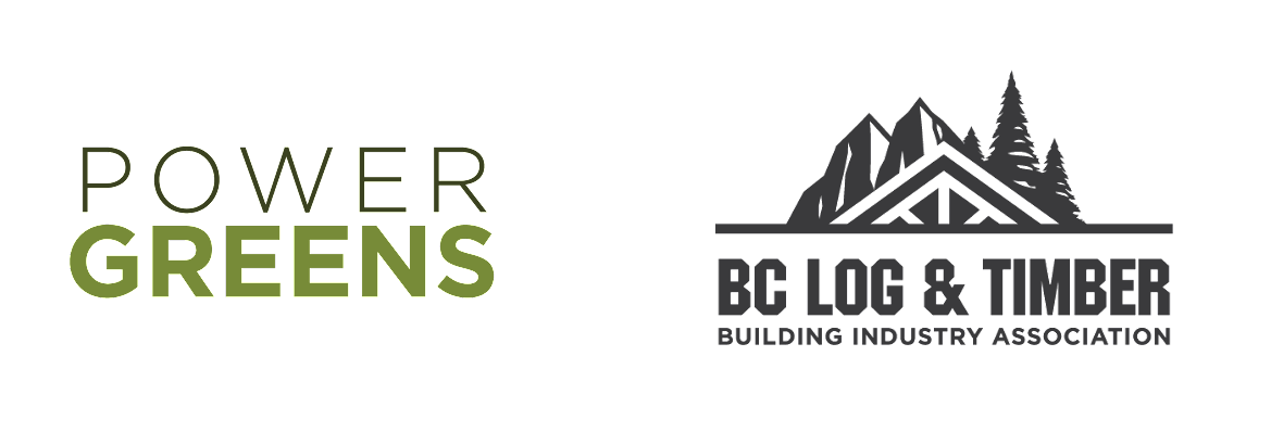
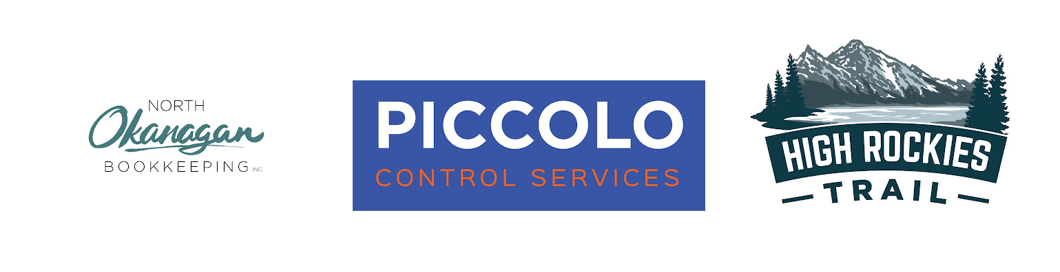
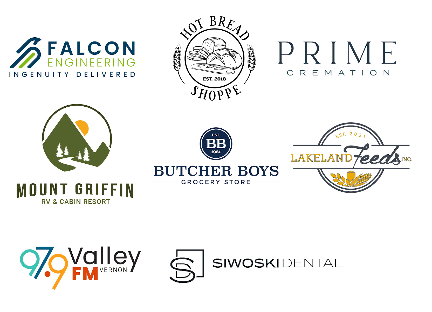
Sadness Anger HappinessEssentially, this boils down to colour theory. This is understanding the emotions that relate to each specific colour – and of course, how to effectively use them when developing a logo. Here are some examples of logos developed by Sproing, and their associated colouring:
Red: Excitement, passion, anger, and loud
Blue: Trust, wealth, maturity, and independence – Blue is a popular colour in branding
Green: Growth, and nature (very flexible colour choice)
Purple: Wealth, royalty, luxurious and feminine
Yellow: Cheerful, adorable, and youthful
Orange: Energetic, vibrant, and invigorating
Pink: Playful, mature, youthful, and feminine – Pink has so many variations (mauve, rose gold, etc.) that it can be both mature and youthful
Black: Sleek, modern, minimalistic, and luxurious
White: Clean, modern, and minimalistic
Grey: Mature, classic, and serious
Of course, there are many variations of colours you can use, which is why you see a company like McDonald’s, using both red and yellow (often associated to trigger hunger) within their logo and advertisements. So what we are saying is, get in touch with your emotions and really dig deep choosing colours!
It’s even more important to understand the emotions behind colours because that’s the feeling you want your logo to represent. A good question to ask yourself is: how do I want my target audience to feel when they see my logo?
Lettering & Typography
It’s important to choose a font that overall compliments your brand and really your logo. There are 4 types of font styles commonly used for logo development.
Serif

This font style can easily make your logo appear more timeless and high-end. This style is pretty versatile too, but works the best with classic designs. You can also spot them easily by their little ‘feet’ in each letter.
Sans Serif
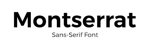
This style is simple and sleek, and works well with modern and minimal brands.
Script
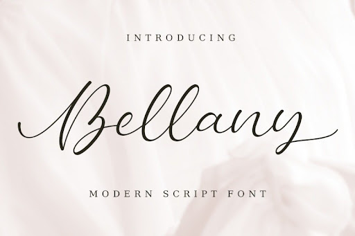
Similar to handwriting, this style has the most variety. After all, there are many different styles of handwriting!
Display
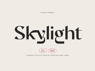
They are very eye-catching, and become very powerful with different fonts.
Now that you have each logotype under your belt, hit up that mood board and start researching what speaks to you! (Yes the research never stops).
Conclusion
So with all that said, developing a logo should come at no surprise that it’s a challenge. Even just breaking down a few important pieces, there is still a lot to know. So, should you still have questions, or maybe you read this blog and thought “wow that’s a lot of work”, then we encourage you to reach out to our team here at Sproing.
We ensure every client has a great experience, and a stress-free one when planning out brand development. Our team here at Sproing can get you onto your feet and kick off your brand.
To learn more about branding & design, click here. To find out more about all our service offerings, and how we can help you, click here.